“Picture Gallery of the Soul” Exhibit at the Katherine Nash Gallery at the University of Minnesota.
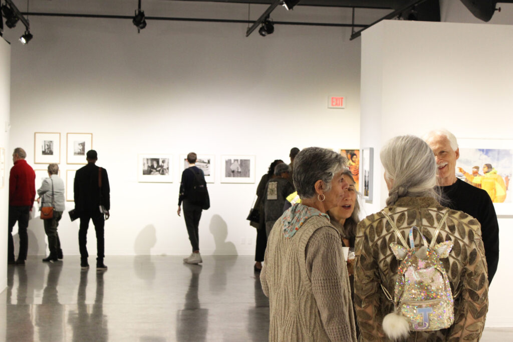
A Picture Gallery of the Soul, is a group exhibition of over 100 Black American artists whose practice incorporates the photographic medium. Sampling a range of photographic expressions from traditional photography to mixed media and conceptual art and spanning a timeframe that includes the 19th, 20th, and 21st centuries, the exhibition honors, celebrates, investigates, and interprets…
Read MoreBehind-the-scenes look at “André Kertész: Postcards from Paris”
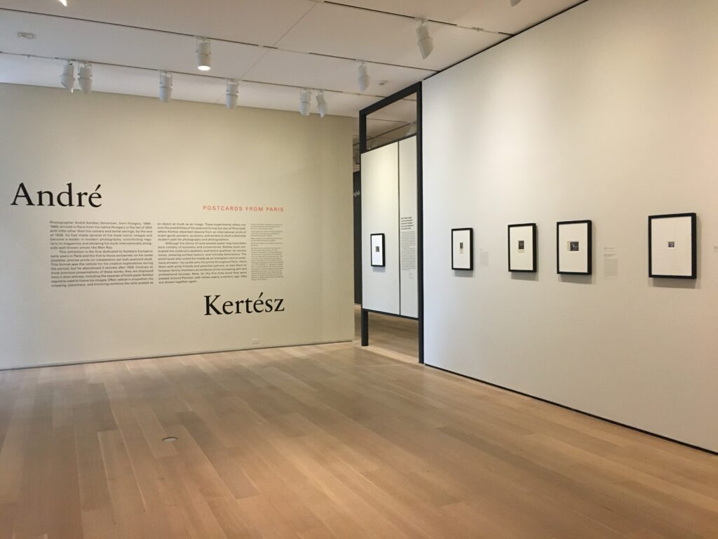
Planning and mounting an exhibition is always difficult. This one was made even more difficult because most of the work was done during the pandemic when the museum staff at the Art Institute of Chicago was working remotely or spending limited time at the museum. We asked Elizabeth Siegel, the curator of the show…
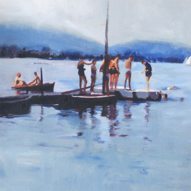
Read MoreLisa McShane “Fluid Reflection” at SMITH & VALLEE GALLERY
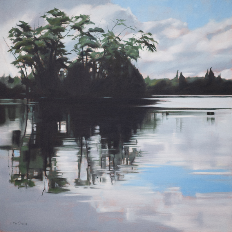
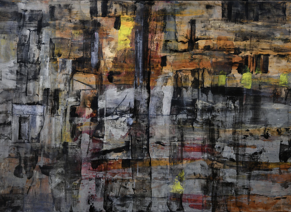
My paintings tend to be a map of my life and my thinking, and these are what I spent my time doing during an odd time in our history. My last show opened March 7, 2020. For many of us that was the last time we were together indoors in a large group. I treasure…
Read More#artinthetimeofcorona interview with Lisa Golightly
This is a one of a series of interviews with our customers to see how they are adapting to the COVID-19 world. Lisa Golightly lives in Portland Oregon and has been a customer since 2012. Her work revolves around memory and how snapshots shape, influence, change and even create memory. She works with acrylic and…
Read More#artinthetimeofcorona interview with Bob Nugent
This is a one of a series of interviews with our customers to see how they are adapting to the COVID-19 world. Bob Nugent lives in Healdsburg, CA and has been a customer for over 20 years. Brazil and the Amazon River Basin are the subject and inspiration for his work. This is his #artinthetimeofcorona…
Read More#artinthetimeofcorona interview with Herman Mhire

This is one in a series of interviews with our customers to see how they are adapting to the COVID-19 world. Herman Mhire lives in Lafayette, LA and has been a customer for over 25 years. Mhire was named Distinguished Professor in the College of the Arts at the University of Louisiana at Lafayette. He…
Read More#artinthetimeofcorona interview with Joanne Ungar
This is a one of a series of interviews with our customers to see how they are adapting to the COVID-19 world. Joanne Ungar lives in New York City and is represented by the Front Room Gallery in New York City. She is a visual artist who makes poured wax artwork. This is her #artinthetimeofcorona…
Read More#artinthetimeofcorona interview with Interact Gallery
Artist Laurie M. working in her home studio. This is one in a series of interviews with our customers to see how they are adapting to the COVID-19 world. Interact is a progressive studio of artists challenging perceptions of disability located in Saint Paul, MN. This is their #artinthetimeofcorona story. Interact’s…
Read More#artinthetimeofcorona interview with Pete Myers
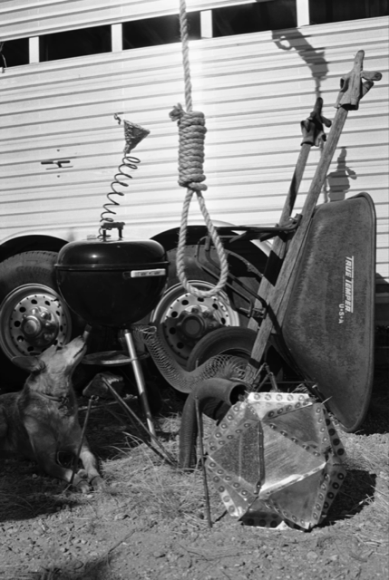
This is a one of a series of interviews with our customers to see how they are adapting to the COVID-19 world. Pete Myers lives in Santa Fe, NM and has been a customer since 2008. Myers is a fine art photographer known for his vivid abstractions of the decaying ruins of the American West.…
Read More#artintimeofcorona interview with Rob Evans
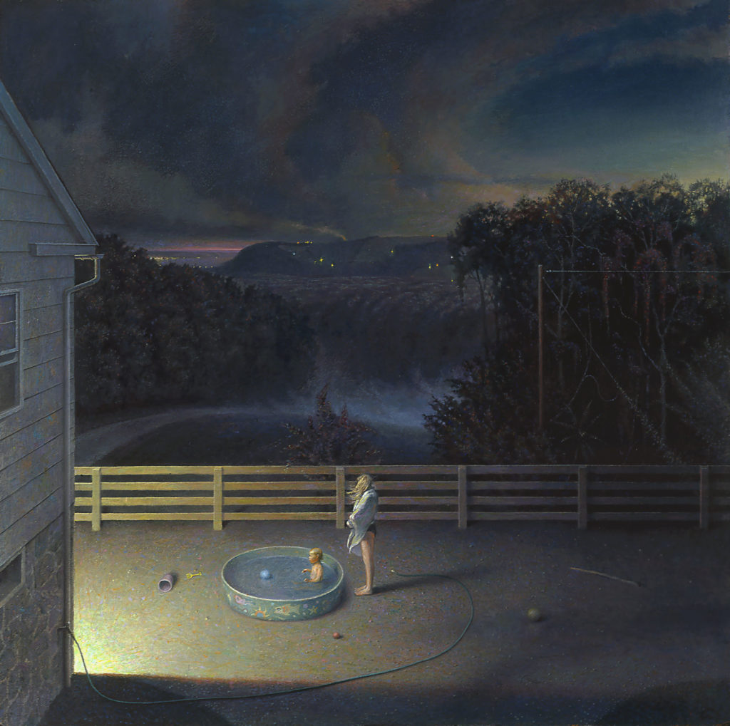
This is one in a series of interviews with our customers to see how they are adapting to the COVID-19 world. Rob Evans lives in Wrightsville, PA and has been a customer since 2012. He is an artist and independent curator. He has been awarded numerous grants including a prestigious fellowship from the Pollock-Krasner Foundation.…
Read More